
THE PROBLEM
Four in ten older adults take five or more medications a day. Design a website and app to help remind users to take medication.
Worked on the project for 3 weeks from May 15th 2023 to June 4th, 2023
THE GOAL
Design a app with older users in mind that is simple and easy to understand and use to remember to take medication.
My role
UX designer leading the app and responsive website design from conception to delivery.
Responsibilities
Researching, conducting usability studies, paper wireframes, digital wireframes, low and high fidelity prototypes.
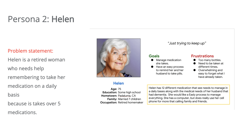
Understanding the user
For the research proportion of the design process I looked at websites and apps that are already on the market to do a competitive audit. I create personas of users that might use the app and website base off of that research.
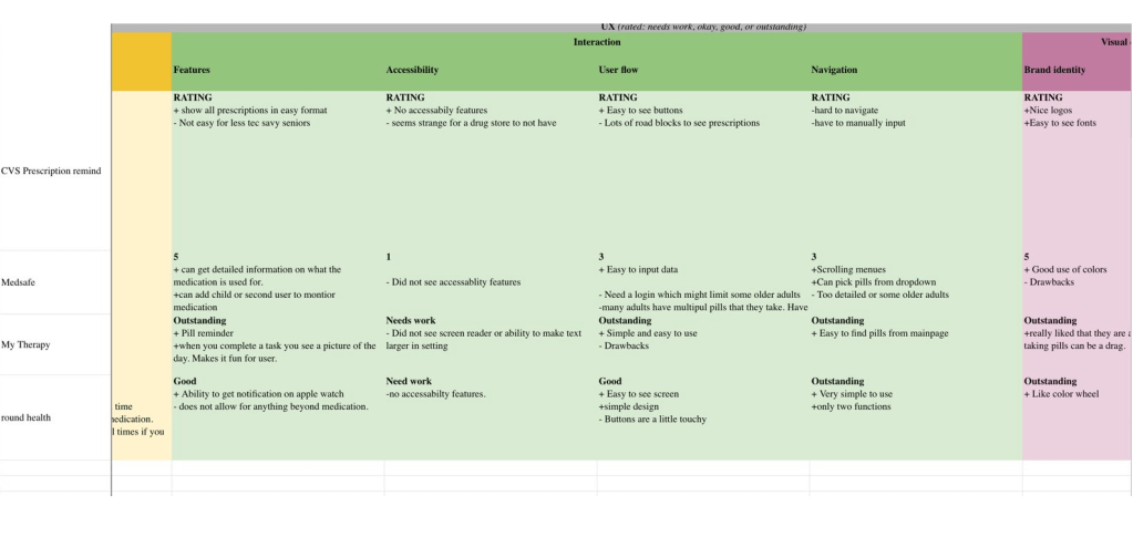
Competitive audit
The goal of the competitive audit was to understand what was on the market.
Most medication reminders did not have stand alone websites for the medication reminders and only had dedicated mobile apps.
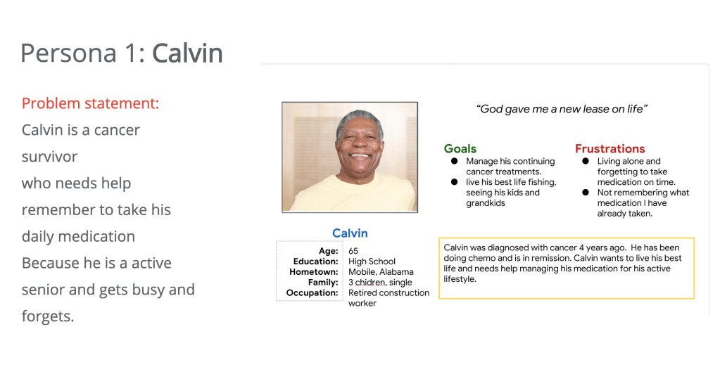
Based on the competitive audit I created two personas for users
Ideation
I did a quick ideation based on the competitive audit, personas created and research at I conducted.
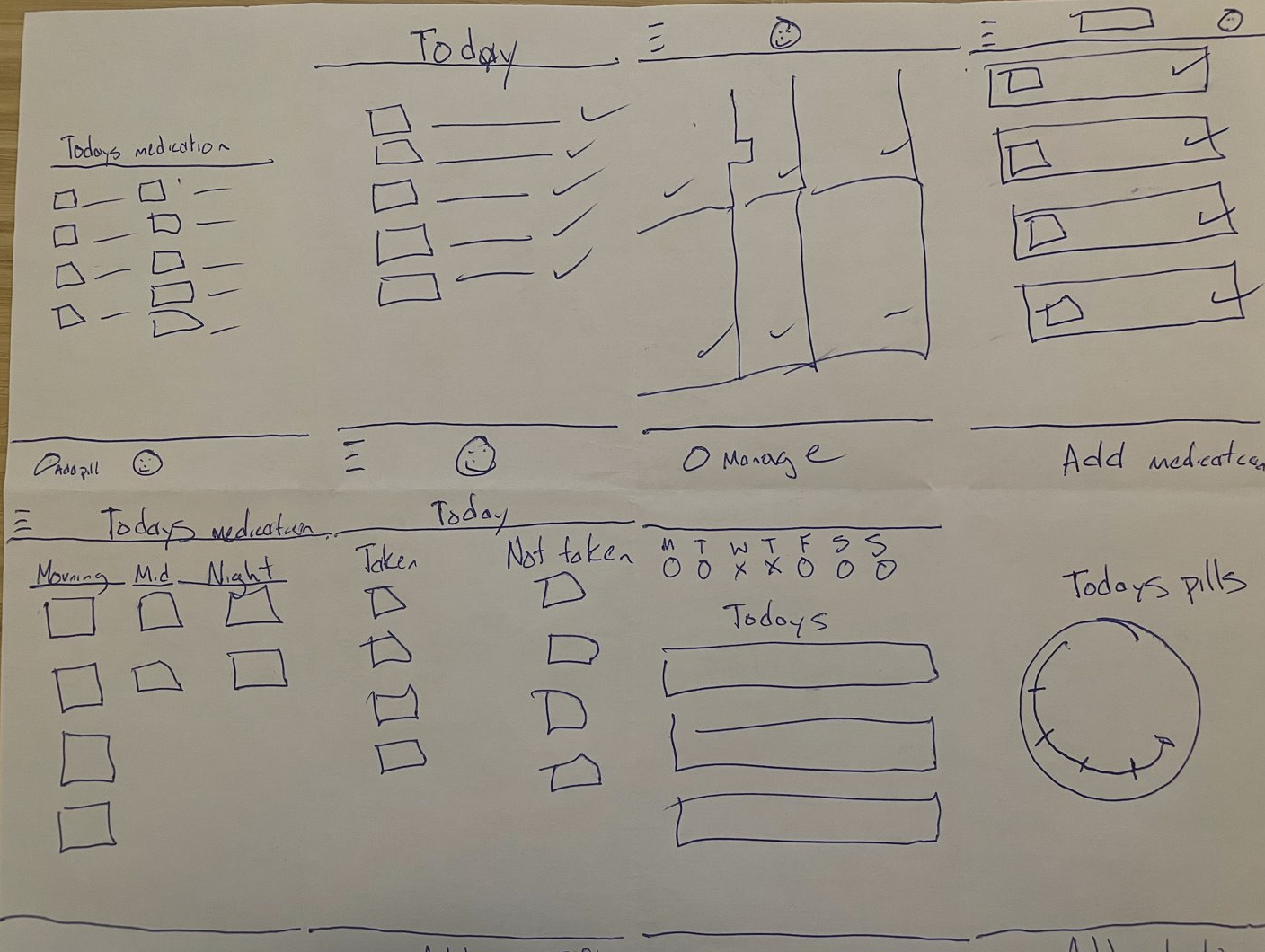
Digital Wireframes
Users needed easy to see functions since some older adults find technology overwhelming.
May users also wanted the ability to go back and see what they had taken previously.
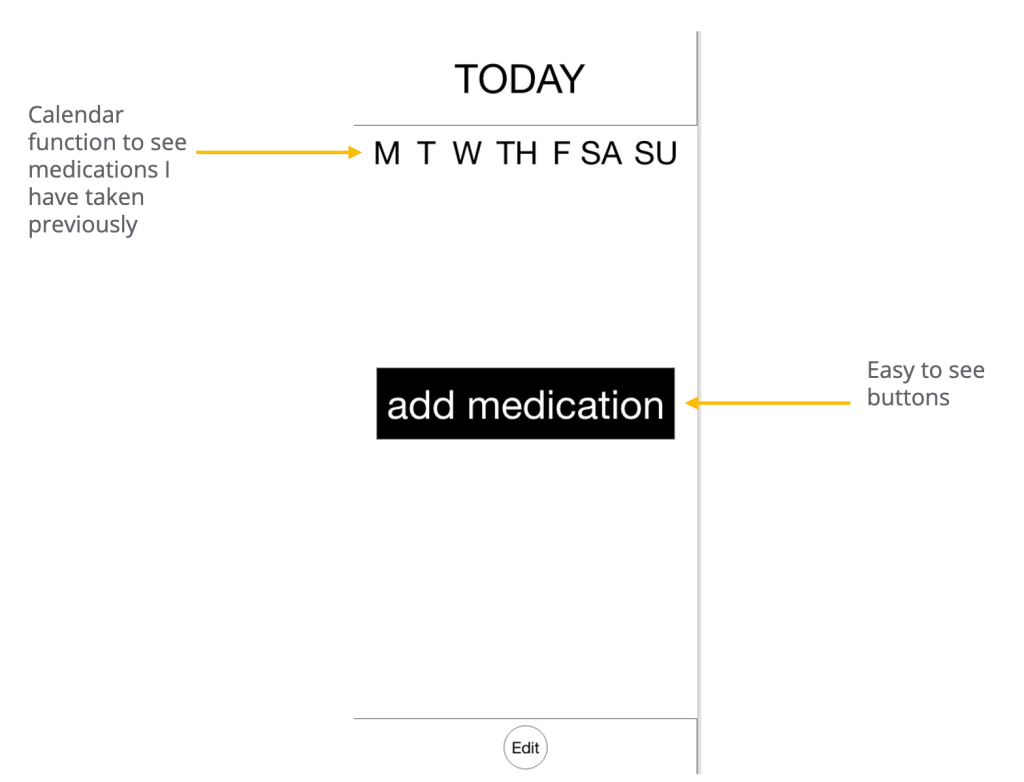
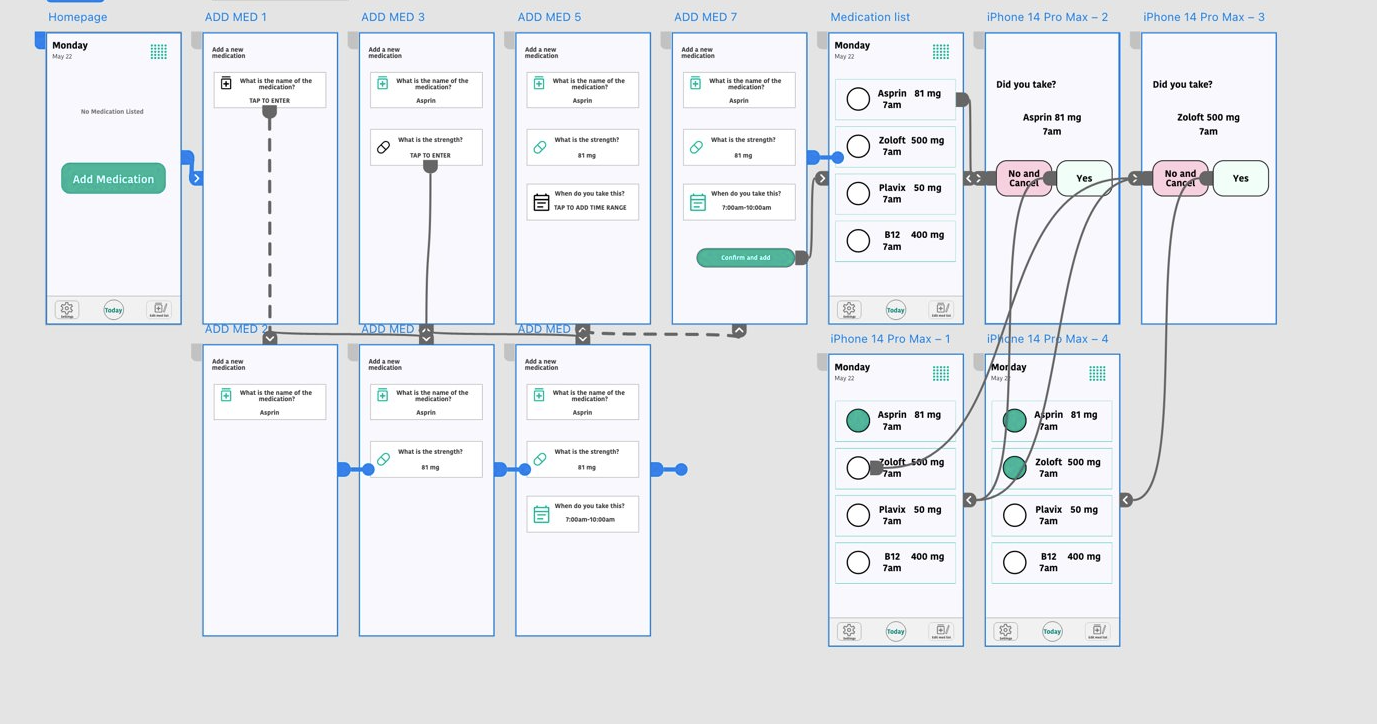
Low-fidelity prototype
LINK to Low-fidelity prototype
In the original wireframes I had the edit medication list on the bottom. Users found that hard to see so I moved that to the top of the page.
Usability Study
Before I moved on to mockups and my high-fidelity prototype I conducted a usability study. The study was moderated and located in Tampa. I focused on users that are 60 and up and it was about 15 minutes in length.
Findings
- Check box was too small for older fingers.
- Edit was not Easily understood. Needs more wording.
- Edit button was hard to find at the bottom.
Mockups
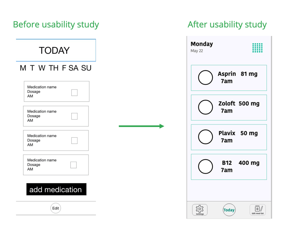
It was important to make sure the check mark function worked for users. I scaled them up after the usability study.
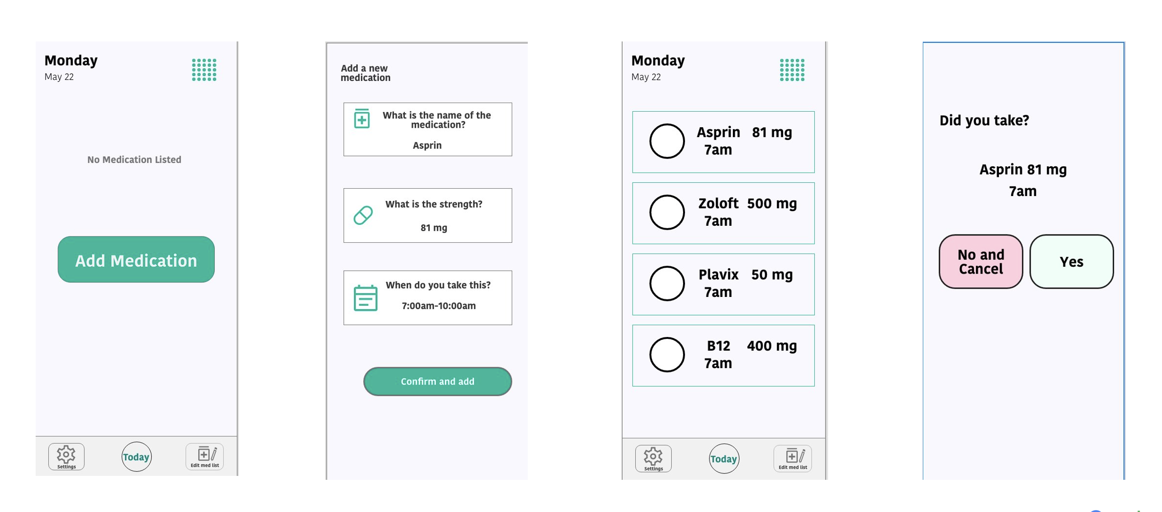
High-fidelity prototype
The high-fidelity prototype changed by making it less likely for the user to have any error when choosing that the took medication with a confirmation screen and larger buttons.
Accessibility considerations
- Large fonts for easy to read text for people with limited vision.
- Large buttons for older fingers and shaky hands to press.
- Error resistant with a confirmation page if you make a mistake.
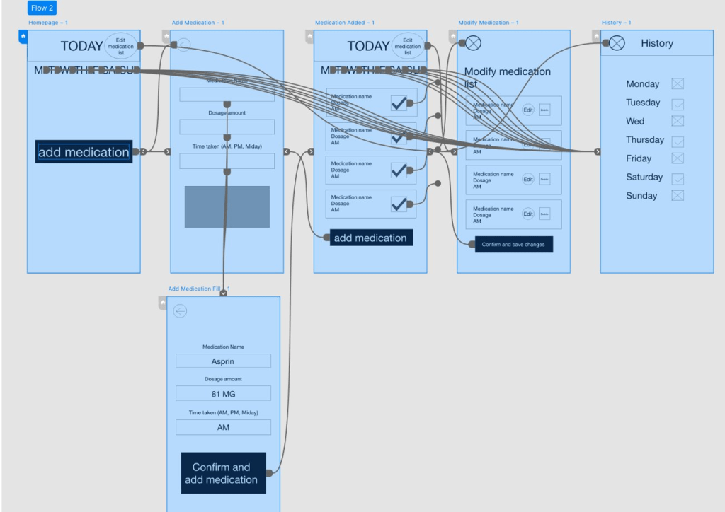
Responsive Design
Sitemap
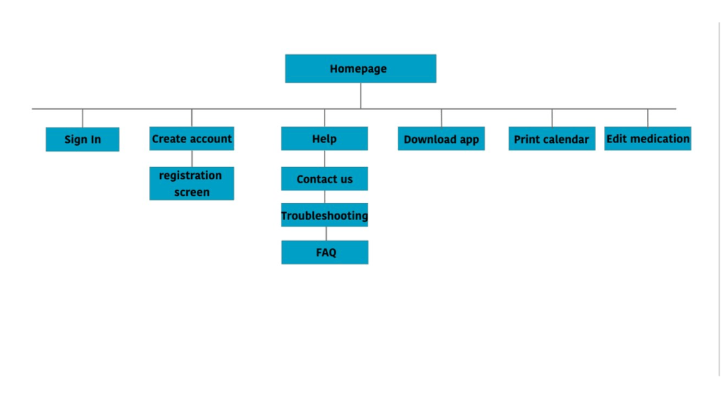
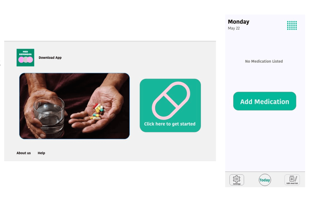
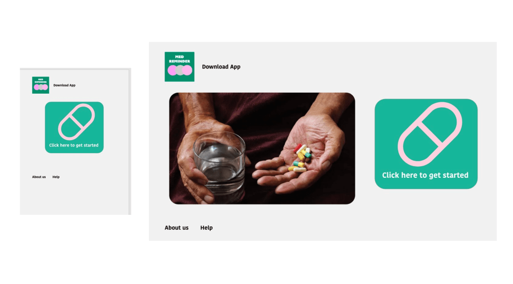
Website would be used in a more limited fashion for printing medication lists to bring to doctor’s offices and to download the app.
Hero image in the website was replaced with large icon only.

Going forward
“The design would help me to remember to take my pills and make it easy to print out for the doctor.”
What I learned
Creating a website for social good is a interesting process and I hope that I can improve on the designs in the future.
Next Steps
- Test responsive website in a usability study.
- See if users prefer the website or app version.
- Make improvements to designs.
