
I created a responsive website for beach/pool side delivery app. For this project I was the lead researcher, created mockups, personas and high-fidelity prototypes.
Project Overview
The product
Companion website to poolside delivery mobile app that was already developed
Project duration
Project was worked on from March 2023-May 2023
The Problem
Most people at the beach preferred the mobile platform, but some only had desktop computers and mobile devices outside the app or did not want to download a app to buy from the snack bar.
The goal
Create a website that would easily help users to gain access to the mobile app. And make the Snack Bar accessible to users that did not download the app.
User Research
The research conducted was done by understanding the type of person that would use this the website compared to the mobile app. What are the pain points that they would experience?
25% of the population of Florida is over 65. 61% of people over 65 own smartphones, while the 96% or people aged 18-29 own a smartphone.
Also users that might be doing a search for the product might use the website to find out additional information about the app.
Pain Points
- Ease of use: users at the beach or pool might not know about the app and need it is to easy to use
- Good for older adults: Many users in beach communities are older and less technically savvy. This requires an app that is easy for seniors to use.
Starting the Design
The website is very similar to the mobile app. The focus is simple buttons and design that allow an easy experience no matter your age or spoken language.
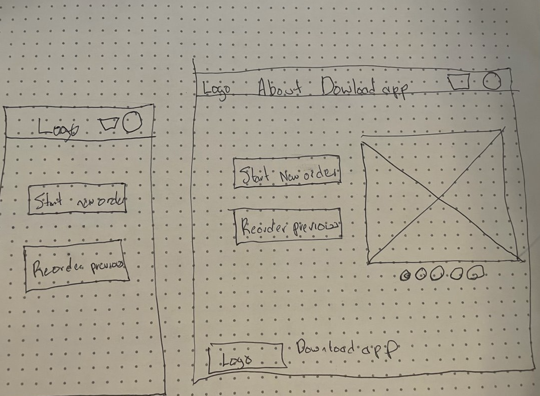
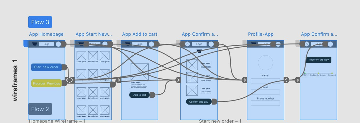
Paper wireframes
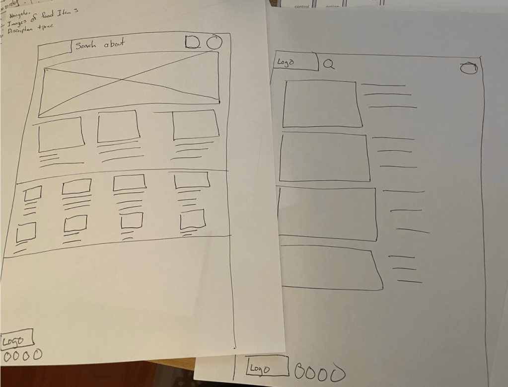
In the original paper wireframes, I wanted to add more images on the homepage and a key picture at the top.
But…
As the process evolved, I went back to a homepage with less text and pictures. The Key picture was kept on the website layout and the tablet, but removed on the mobile phone version.
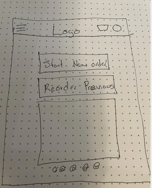
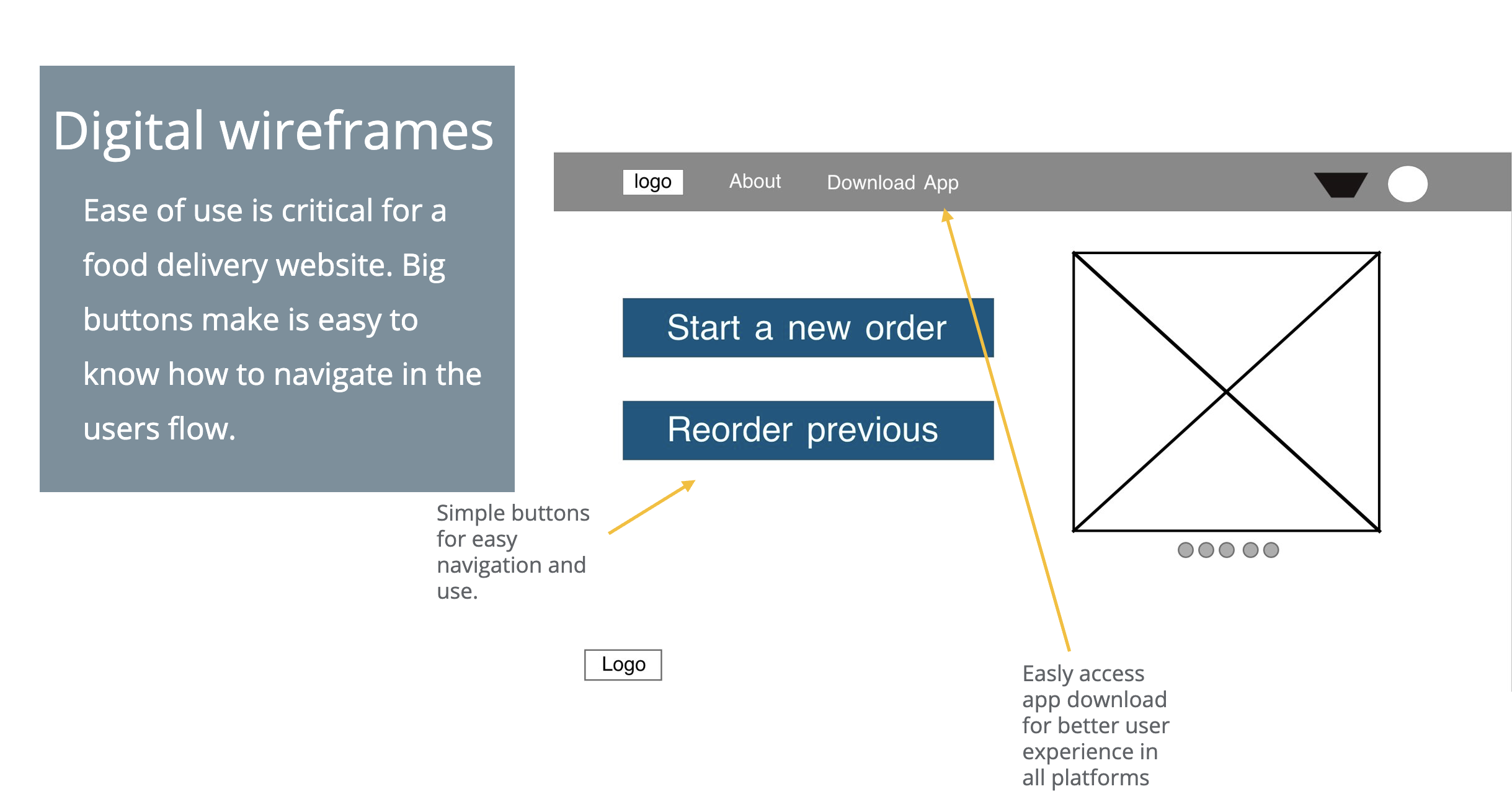
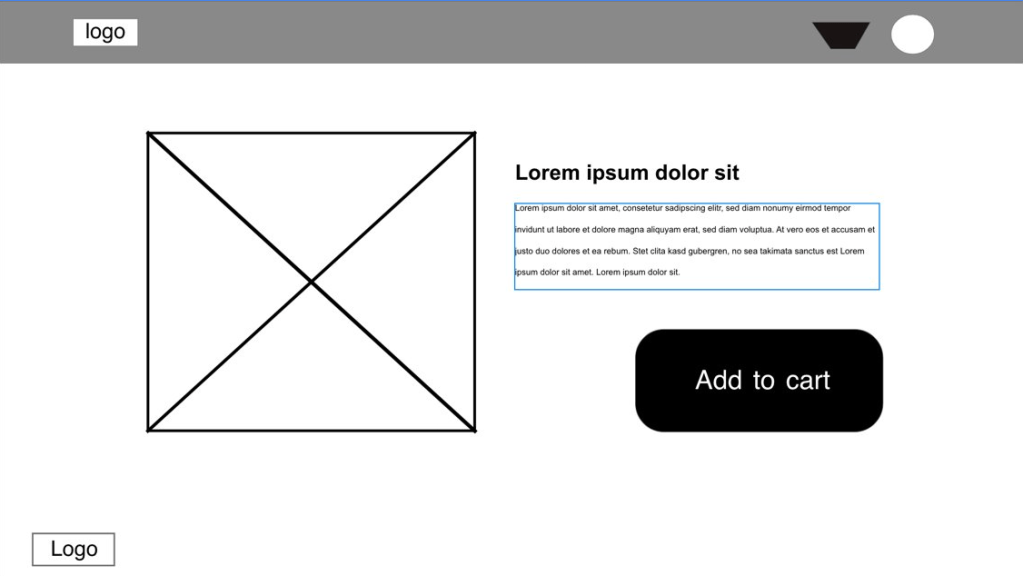
Digital wireframe screen size variation(s)
The mobile app was sized down to make the text and add to cart button underneath the picture and not side by side as it is in the webpage.

Mobile phone interface
Website wireframe
Low-fidelity prototype
The user journey focuses on ease of use. The web version makes a clear area to download the app for a mobile phone for a better experience.
Low-fidelity prototype website

Low-fidelity prototype mobile phone
Usability Study
The final step before I moved on to mockups is I conducted a usability study. It was a moderated study with 5 participants. It lasted about 15-20 minutes.
Findings
- Users thought the homepage was easy to navigate.
- Users did not like that the logo change position in different pages.
- Users did not like that the webpage used a QR code to download the app.
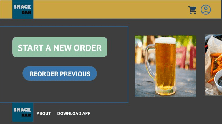
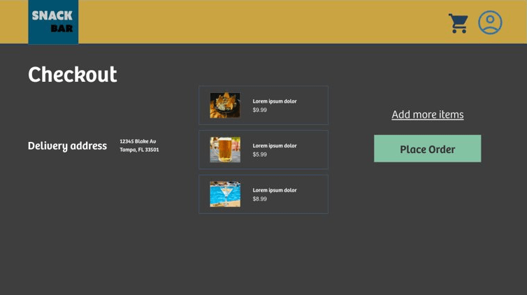
Mockups
Logo now maintains a clear placement flush left on all screens of easy return to the homepage.
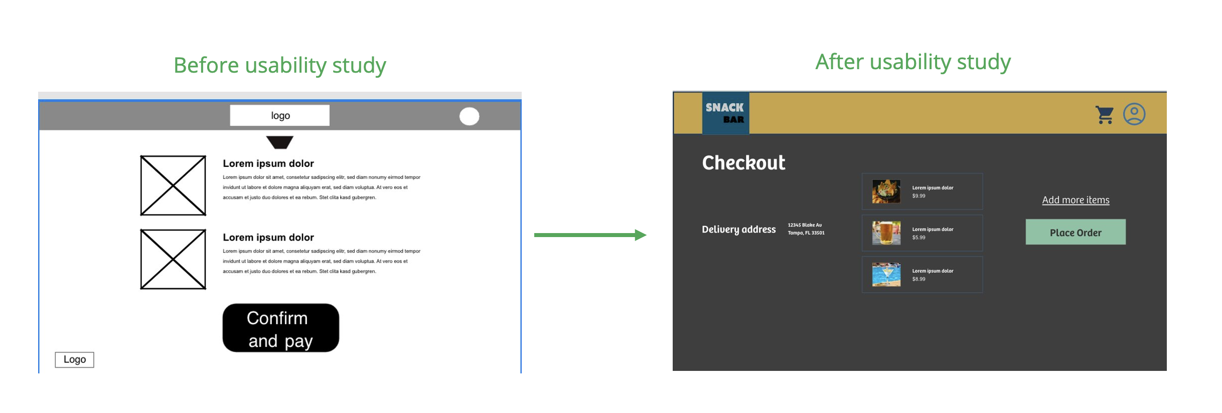
Use of a QR code was removed from original version and replace with link to app

Mockups: Website screen size
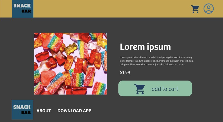

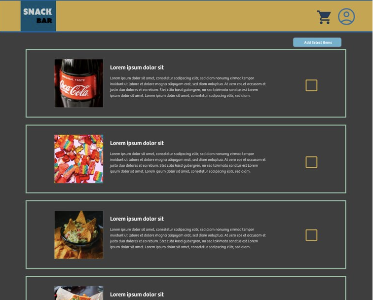

Mockups: Screen size variations

High-fidelity prototype
Link to high-fidelity prototype

Accessibility considerations
- Used dark mode for higher contrast to make it easier to read.
- Easy to see and read pictures and text.
- Simple buttons for ease of use.
Going forward
Impact:
The designs I created for the website are used to drive traffic to use of the mobile app while at the beach or pool. It is important to have the ability to show the interface in multiple platforms even if it is a limited user base.
What I learned:
I learned how to create projects in Adobe XD. I found the platform easier to use the more I experienced it.
What’s next?
- Continue to work on refining the image carousel in website.
- Work with a engineer for solutions to create a tracking feature in the app.
- See if any local pools are interested in testing the app with the interface.
 Flying Panda Productions